

The July 2 work session included a presentation billed as neutral education on real estate development economics. A closer read shows several places where the numbers do not hold up, or where the standard being cited does not match the standard being used.
At the work session, Planning Commissioner Aaron Graves presented a slide deck titled CRE Development 101: Understanding Commercial Real Estate Development Economics. It was framed as general education, the kind of primer you’d give someone who has never seen a real estate pro forma before. In many respects it is a useful primer. It explains developer termsnet operating income1, cap rates2, yield on cost3, and the capital stack4 clearly and correctly.
But the deck is not only a glossary. It builds, step by step, toward a specific conclusion: that a taller, denser building is the version of a hypothetical Narberth project that "works", and that a modest workforce-housing set-aside is a small price for the borough to pay in exchange for that added height. That is a legitimate argument for a developer or a sympathetic planner to make. It is not, however, a neutral one, and several of the numbers used to support it do not hold up to a close read.
This presentation shows the Planning Commission as being very slanted to the interests of developers with disregard to those of us who actually live here in Narberth.
Here is what a closer look finds.
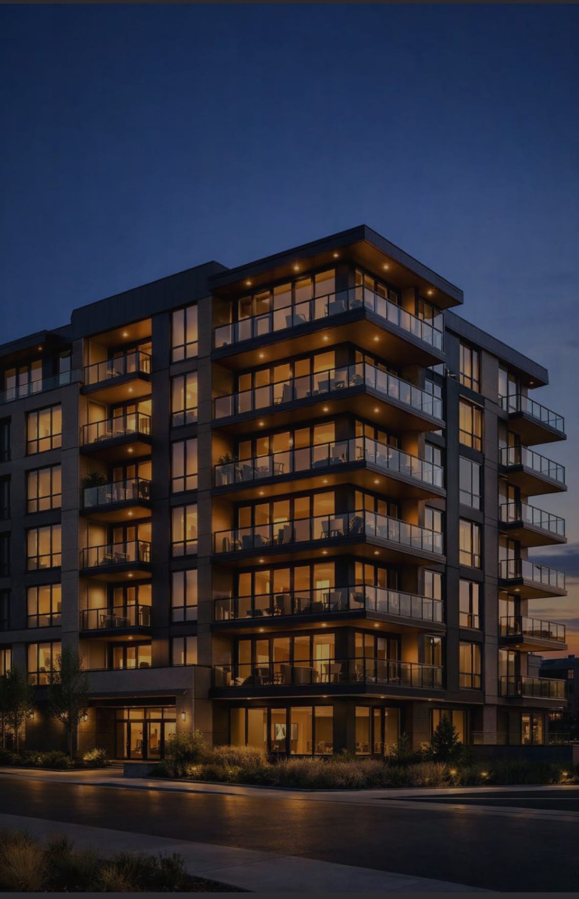
Everyone has their lights on
“10% workforce housing” means 10% of the units, not 10% of the building
This is worth stating plainly before anything else, because it is easy to read past it. When the presentation talks about a "10% workforce housing set-aside", it does not mean the project becomes 10% cheaper, or that the whole building is run as affordable housing, or that every resident gets a reduced rent. It means exactly one tenth of the apartments are reserved for income-qualified tenants, and the other nine tenths rent at full, uncapped market rate with no income test at all.
In the deck’s own 50-unit example, “10% at 80% AMI5” works out to five apartments, out of fifty, renting at $1,850 a month to households that qualify under that income limit. The remaining forty-five apartments rent at the full market rate shown elsewhere in the deck, upward of $2,650 a month for a one bedroom, with no income restriction whatsoever.
That distinction matters for two reasons. First, it is easy for a reader skimming a headline number like “10% workforce housing” to assume a much larger public benefit than what is actually on offer. Second, and more importantly for the numbers that follow, it is precisely because the set-aside touches so few units that the presentation is able to describe its cost to the project as small. A concession that only applies to one apartment in ten will almost always look modest on a project’s bottom line. That is not evidence the concession is generous. It is close to a mathematical certainty given how narrow the concession is. Keep that in mind heading into the next point, which looks at what happens when the income cutoff itself is examined more closely.
The deck breaks its own rule
Early in the presentation, on the slide covering yield on cost and feasibility, the presentation sets out a rule of thumb: a spread6 of 100 to 200 basis points7 between a project’s yield on cost and the market’s exit cap rate is enough to justify the risk of building.
Later, the deck runs the numbers for a hypothetical 40 unit, four story apartment building in Narberth. That building comes out to a 6.60 percent yield on cost against a 5.5 percent market cap rate, a spread of 110 basis points. That is squarely inside the range the deck itself just said was sufficient.
Two slides later, when the presentation wants to make the case for a fifth floor, that identical 110 basis point spread is relabeled "too thin right now".
This is not a matter of differing opinions or a subjective judgment call. It is the same number, produced by the same model, called sufficient on one slide and insufficient on the next, because the second label is the one that supports adding a story. Anyone reviewing this presentation, at Council, at the Planning Commission, or anywhere else, is entitled to ask directly: by the deck’s own stated rule of thumb, is the four story version feasible or not?
A national story used to justify a local zoning change
A large portion of the presentation (roughly a third of it) is devoted to explaining why development is harder nationally in 2026 than it was in 2021: interest rates roughly doubled, construction costs rose 15 to 25 percent, and cap rates expanded, meaning the same income stream is worth less when sold. All of that is accurate as a description of the national multifamily market.
But the presentation’s own comparable-rents slide tells a different story about Narberth specifically. It lists five nearby apartment buildings with average one bedroom rents of $2,503 per month and average two bedroom rents of $3,906 per month, both well above the national trend the "headwinds" section describes. A neighborhood with rents at that level, next to a regional rail station, is not obviously the kind of distressed submarket that needs special zoning accommodation to attract investment. If anything, it is evidence the opposite might be true: that a well-located project here should already work under existing rules.
There’s also a structural issue with using a national interest-rate and cap-rate cycle to argue for a permanent change to the borough’s zoning code. Interest rates and cap rates move in cycles. Zoning does not expire when the cycle turns. If the real obstacle is 2026 financing conditions, that argues for patience, or for interim tools like bridge financing, not for a permanent increase in by-right density.
The fifth floor may cost more than the model shows
This is the most technical point, but it matters because it is the one on which the whole "add a floor" argument rests.
The presentation treats the step from a four story to a five story building as a nearly free win: land and design costs are fixed regardless of story count, the argument goes, so spreading them over more units lowers the cost per unit. Under this framing, adding a fifth floor “only” costs about $2.7 million and returns $256,000 in extra NOI, a strong 9.4 percent return on that fifth floor alone.
There’s a missing piece here. Most modern mid-rise apartment buildings, the kind built with wood framing over a concrete ground floor (sometimes called “five over one” buildings), are governed by building code rules that set maximum story counts by construction type. Under the International Building Code, the more common and less expensive wood-frame construction type (Type V-A) is generally limited to four stories. Getting to five stories of wood framing typically requires stepping up to a different, more fire-resistant construction classification (Type III-A), which usually costs more per floor, not the same or less. The industry sometimes calls this the “five over one” or podium design, and the four-to-five-story line is a well-known cost threshold in the development world. Wikipedia has a good plain-language overview of how this works, and WoodWorks, an industry association, publishes a more technical explanation of the code path.
None of this appears in the presentation’s cost model. If the fifth floor actually requires a costlier construction type, the marginal cost of that floor is understated and the 9.4 percent return figure is quite optimistic. This is a fair, specific, question: does the fifth floor stay within the same construction type as the floors below it, and if not, what does that do to these numbers?
Separately, and more simply: there is no line item for parking anywhere in the cost model, on a project of 40 or 50 units. Either parking cost is bundled invisibly somewhere else in the budget, or the model is quietly assuming a parking reduction that has not actually been granted.
The affordability comparison quietly changes its own benchmark
As covered above, the workforce-housing section runs its numbers at 80% AMI5. At that level, reserving 10 percent of units for workforce housing is shown to cost the project only 24 basis points of yield, described as "a modest concession".
Two slides later, the presentation cites Philadelphia’s zoning code as the standard it is following. But Philadelphia’s mixed-income housing bonus, the actual program cited, sets its affordability requirement at 60% AMI, not 80%. You can read the Philadelphia zoning code provision directly here.
Sixty percent AMI means a lower income cutoff and a lower allowable rent than 80 percent AMI8, so it costs a developer more in foregone revenue to satisfy, on top of already being one tenth of the units as established above. The presentation uses the cheaper, easier 80 percent AMI case to demonstrate that affordability is a "modest concession", then separately cites a program that actually requires the deeper, costlier 60 percent AMI standard as its precedent. The two numbers never appear side by side. Rerun the sensitivity table at 60 percent AMI, since that is the actual standard being cited as justification, and does this "modest concession" still hold.
The return targets are a business choice, not a law of nature
The presentation opens by establishing that real estate investors "require" annual returns of 12 to 15 percent for value-add projects and 15 to 20 percent for ground-up development, framed as the return needed to compensate for the risk and illiquidity of the asset class. Everything that follows treats that hurdle as fixed, something the zoning code must accommodate if anything is going to get built.
That return requirement is real, but it belongs to one kind of investor: an institutional, private-equity-style developer raising capital from limited partners who expect that kind of return. It is not a universal law. A community land trust, a public housing authority, a mission-driven nonprofit developer, or a borough acquiring a parcel for public use are not bound by that same hurdle, and in some cases don’t need to clear any private return hurdle at all. The presentation never surfaces this as a choice. It presents one specific financing model’s target return as the ceiling that public policy must design around, rather than one option among several for how a parcel could be developed.
Real tools were listed but never actually run through the model
Near the end, the deck lists a wide range of tools that can support affordable and workforce housing: LIHTC (Low-Income Housing Tax Credits), PILOTs (payments in lieu of taxes), tax increment financing, housing trust funds, and others. This is a legitimate and useful list.
None of these tools are ever plugged into the actual financial model. If the real constraint, as the presentation states, is that a 20 percent workforce set-aside would drop the project’s yield below a feasible threshold, the natural next step would be to show whether one or two of these tools (a PILOT reducing the tax burden, for instance, or a partial LIHTC allocation) could close that gap and support a deeper affordability commitment without requiring more density. Because that step is missing, the list reads more like a demonstration of awareness than a genuine alternative that was tested and set aside.
Why this matters
None of this means the underlying economics in the presentation are fabricated. Interest rates have risen. Construction costs have risen. Cap rates have expanded. Those are real, national trends, and any project proposed for Narberth will have to contend with them.
What it does mean is that this particular presentation, delivered by a sitting Planning Commissioner at a Council work session, is not simply neutral education. It is built to arrive at a specific conclusion (more density, paired with a set-aside standard, applied to a tenth of the building, that is softer than the one it cites as precedent), and several of the assumptions that get it there do not survive close reading: an internal contradiction on what counts as a feasible return, a national narrative applied to a submarket with above-average rents, an optimistic assumption about what a fifth floor actually costs to build, and an affordability comparison that switches benchmarks between the slide that sets the standard and the slide that models the cost.
Before this kind of analysis becomes the technical basis for a zoning decision, it is reasonable to ask that the underlying model, including its construction-type assumptions, its parking assumptions, and the AMI level it is actually modeling, be shared for independent review.
Thanks for reading.
The views expressed in this article are those of the author and do not necessarily reflect the position of Our Narberth, Inc., its board, or its members.
Net Operating Income: a property’s income after covering operating costs like maintenance and management, but before any mortgage or loan payment comes out. It measures what the property itself earns, independent of how it was financed. ↩︎
Cap rate: a property’s annual net operating income divided by its value. It is the market’s shorthand for the return an all-cash, no-debt buyer expects to earn on the purchase. ↩︎
Yield on Cost: a project’s stabilized net operating income divided by its total cost to build. It is the return a developer earns on every dollar spent building the project, before any financing is layered on top. ↩︎
Capital stack: the layered mix of loans and investor money that finances a project, stacked in order of risk. Senior lenders sit at the bottom and get paid first; the developer’s own equity sits at the top and gets paid last, but keeps most of the upside. ↩︎
Area Median Income (AMI): an income benchmark set annually for the region, used to decide who qualifies to rent an income-restricted unit and what that unit’s rent is capped at. A household at 80% AMI earns less than a household at 100% AMI, and a household at 60% AMI earns less still. ↩︎ ↩︎
Development spread: the gap between a project’s yield on cost and the market’s exit cap rate. It functions as the developer’s cushion, the extra return built in to compensate for the risk of construction and lease-up. ↩︎
A basis point is one hundredth of a percent, so 100 to 200 basis points equals 1.0 to 2.0 percentage points. ↩︎
HUD doesn’t set Area Median Income at the city or borough level. It sets one AMI figure per year for each federally-defined metropolitan area (HUD calls these HMFAs, “HUD Metro FMR Areas,” which mostly track OMB’s Metropolitan Statistical Areas). Philadelphia County and Montgomery County (where Narberth sits) are both explicitly part of the same one: the “Philadelphia-Camden-Wilmington, PA-NJ-DE-MD MSA.” HUD’s own documentation for this area lists its member counties by name: New Castle County DE; Cecil County MD; Burlington, Camden, Gloucester, and Salem Counties NJ; and Bucks, Chester, Delaware, Montgomery, and Philadelphia Counties PA, all treated as one income-limit area. That means a household earning 60% of AMI in Narberth and a household earning 60% of AMI in Philadelphia are measured against the exact same dollar threshold, because it’s the same underlying AMI calculation. There’s no separate, wealthier “Main Line” AMI figure and a separate, lower “Philadelphia city” AMI figure. It’s one number for the whole 9-county, 4-state region. ↩︎